You no longer have a choice; your website must be optimized for mobile devices, that is to say, “mobile-friendly,” as we say in the beautiful language of Shakespeare.
Why? The reason is simple, and you probably already have it on the tip of your tongue: 80% of people who use the internet have a smartphone, and more than half of the traffic comes from mobile devices. If a visitor visits your website while they are behind their smartphone, there is a greater chance that they will be behind their smartphone than in front of their computer. Hence the importance and even the need to offer optimal mobile navigation on your website.
If you have a website that doesn’t display well on mobile, you’re sure to miss out on a significant chunk of your traffic and end up losing some.
Not to mention that Google uses the “mobile-friendly” criterion to classify web pages in the results pages. Optimizing your website for mobile has a strong impact on the famous SEO or natural referencing. One more reason!
In detail, we will see how to create a mobile-friendly website and, more generally, how to optimize your site to adapt as best as possible to the size of mobile screens.
12 tips for getting a mobile-friendly website
After this little introduction, the time has come for concrete and practical advice. We took 12 of them from our wallets. Most of them should interest you, at least we hope so.
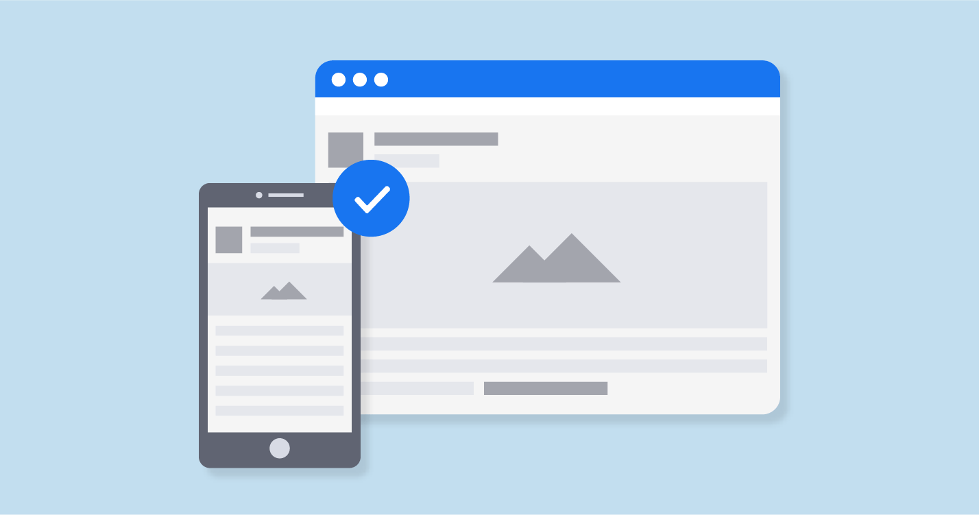
# 1 Install a responsive theme
If you have a website that is not suitable for mobile and wants to fix it quickly, the best solution is to completely change your graphic theme. If you have a site already well set up running well, this might not be the best option. But if you have low traffic or are just getting started (let alone), installing a responsive theme is the best thing you have to do. If you are using WordPress, changing the theme is very easy. Just go to Appearances> Themes and activate a new theme. You can type “responsive” in the search bar to find a responsive theme.
Like Strikingly or Weebly, some website builders allow you to change themes in one click (but all their themes are responsive a priori, so the problem does not arise).
Once you have your responsive theme, make sure you adhere to the following tips to maintain your website’s mobile quality.
# 2 Simplify the menus on your site
You won’t be taught anything by telling you that mobile screens are significantly smaller than computer screens. It would be highly recommended that when designing your menus, you stay quite clear in your mind. The menu for the desktop version of your site can be larger and offer more options. On mobile, things get complicated. You must be concise and respect the dimensional constraints associated with the mobile display. It would help if you simplified the menus so that your users don’t have to scroll and zoom to navigate your site (chances are they won’t bother and look elsewhere):
Except in rare cases and situations, it is advisable to also remove the mobile version’s sidebar.
# 3 make forms as short as possible
Long forms convert less well (all other things being equal); they reduce mobile user experience. On a computer, if a form is not displayed entirely on the screen, it is not a big deal; navigation is quite simple; use the mouse wheel. But on a mobile, it is even more complicated. Therefore, go through all your forms and reduce their size if they are too long, removing unnecessary fields. For example, you do not need to ask for the postal address and contact number on a newsletter registration form.
# 4 display your CTAs
CTA buttons should be prominent and easy to click. At all costs, we must prevent several buttons from appearing on the screen at the same time. Your CTAs should be focused on the main objective of your page.
Take care of the way they display – this has a key impact on your conversion rates. A study showed that on more than half of websites, Internet users took more than 3 seconds to identify CTAs. It is too much; you can do better.
# 5 Integrate an internal search engine
This advice echoes what we said earlier about the menus. As of this writing, there may be some of you who have more than 20 or 30 entries in your menus. It’s hard to simplify a menu of 30 entries to fit everything on a mobile screen. In this case, the option is to integrate a search bar so that the Internet user can more quickly access the content he is looking for. This avoids ending up with a menu that is too big.
If you have an e-commerce site, the internal search engine is a must-have feature, especially when you have a catalog with more than 12 million products like Amazon!
# 6 Facilitate access to customer service
Even if you spend all of your time improving your website’s mobile version, there will always be people who are having trouble browsing and who need you to answer questions for them. You aim to quickly and easily get your guests to solve their problems. To do this, make sure that your contact information is easily accessible. Give a phone number and email address links to your social networks.
# 7 Size matters
Navigating a website from a computer is easy; it’s simple. You control everything thanks to the cursor of your mouse or your keypad. But navigating with inches on a 4-inch screen is not the same thing. Never lose sight of this reality when you create the various elements of your mobile website. Buttons should be large enough to be clickable with a finger. The gap between the buttons/links must be sufficient to not click on the wrong button. It would help if you always kept in mind the clickable areas on a screen. This illustration shows the most clickable areas:
75% of users navigate on their mobile with their thumb. Avoid integrating buttons in the corners and at the top of the screen: these are the least accessible places for the thumb. Regardless of the phone’s size, the elements should ideally be placed towards the screen’s middle.
# 8 remove popups
Try to remove popups from your mobile site. Already, in itself, people do not appreciate this format. On mobile, they further degrade the user experience because they are often difficult to close. You have probably already had this experience: from your mobile; you land on a website, a popup is displayed, it is impossible to close it, you leave the page. Sometimes the cross is not visible on the screen… which is problematic. Especially since it is not always possible to correctly zoom out a popup. Let’s say it: there are times when it is downright impossible to close the popup and therefore access the website’s content.
If you can’t afford to remove the popups, test their display on mobile well, try to simplify them, and only show them to visitors who have already clicked on your website or who have been on your site for more than a few seconds…
# 9 Avoid large blocks of text
The amount of text shown on your mobile website needs to be decreased. Of course, you need to communicate to your visitors, so you need texts, words. But choose short sentences, shorten paragraphs if you want your content to be read. Don’t forget: if a paragraph is four lines on the desktop version, it could very well be 12 on the mobile version!
# 10 choose the right font
Let’s continue to talk about the text. The choice of the typeface is an important decision. It would help if you opted for a clear and easy to read font. You can also play with the fonts to highlight a paragraph or a section of the page. Use bold and capitals to structure the content.
# 11 Optimize the loading speed of your website
It would help if you always kept the topic of pace in mind, no matter what improvements you plan to make on your mobile website. Studies have shown that people leave the website when the page load is longer than 3 seconds… The faster the website, the higher the bounce rate will be. To optimize the loading speed, simplify your mobile site’s design, optimize the images, and delete unnecessary images …
# 12 Create Accelerated Mobile Pages (AMP)
Accelerated Mobile Pages (AMP) are HTML pages that use a specific format. Google supports this format. Google highlights pages that are in AMP format on mobile in search results.
The advantage of AMPs is their loading speed, which is much faster than traditional pages. For this reason, it is Google that favors them. If you use WordPress, be aware that creating accelerated mobile pages is very simple: a plugin. To learn more about this special format, I invite you to discover the complete guide we designed on the subject.
Conclusion
If you’re not looking to improve your website’s display on mobile, you miss out on history and missing out on some of your traffic (worse: you will end up losing some of your current traffic, more and more “mobile”). We have seen the different actions to take to make your site mobile-friendly: simplify the menus, shorten the forms, display your buttons properly, limit yourself to one button per page, add a search bar to facilitate navigation and free up space. ‘screen space, improve the loading speed of your site, etc.
If you want to make your website mobile-friendly or want to design a website, contact us. We develop websites and integrate efficient applications that connect to your existing tools. We create amazing web design in Pakistan that brings the highest potentialities for you and your team. Our engaging features of web design and development will assist you in reaching your target audience.
 The Creative Journal